2023
Hiredeck
With Odro creating a time-saving digital shortlisting portal, they needed branding for what would become their first stand alone product.
Client / Hiredeck
There are already many products that fall under the Odro umbrella, so it was important that the new design followed a similar layout and the same font as the branding used for products beforehand. They wanted an emblem that could be identifiable independently, but still easily recognisable as an Odro product.
Originally, this emblem actually started out as a deck of cards via the CEO’s request, but through development was turned into more of an arrow, with the purpose of symbolising the sleek direction the candidate would take while using the platform.
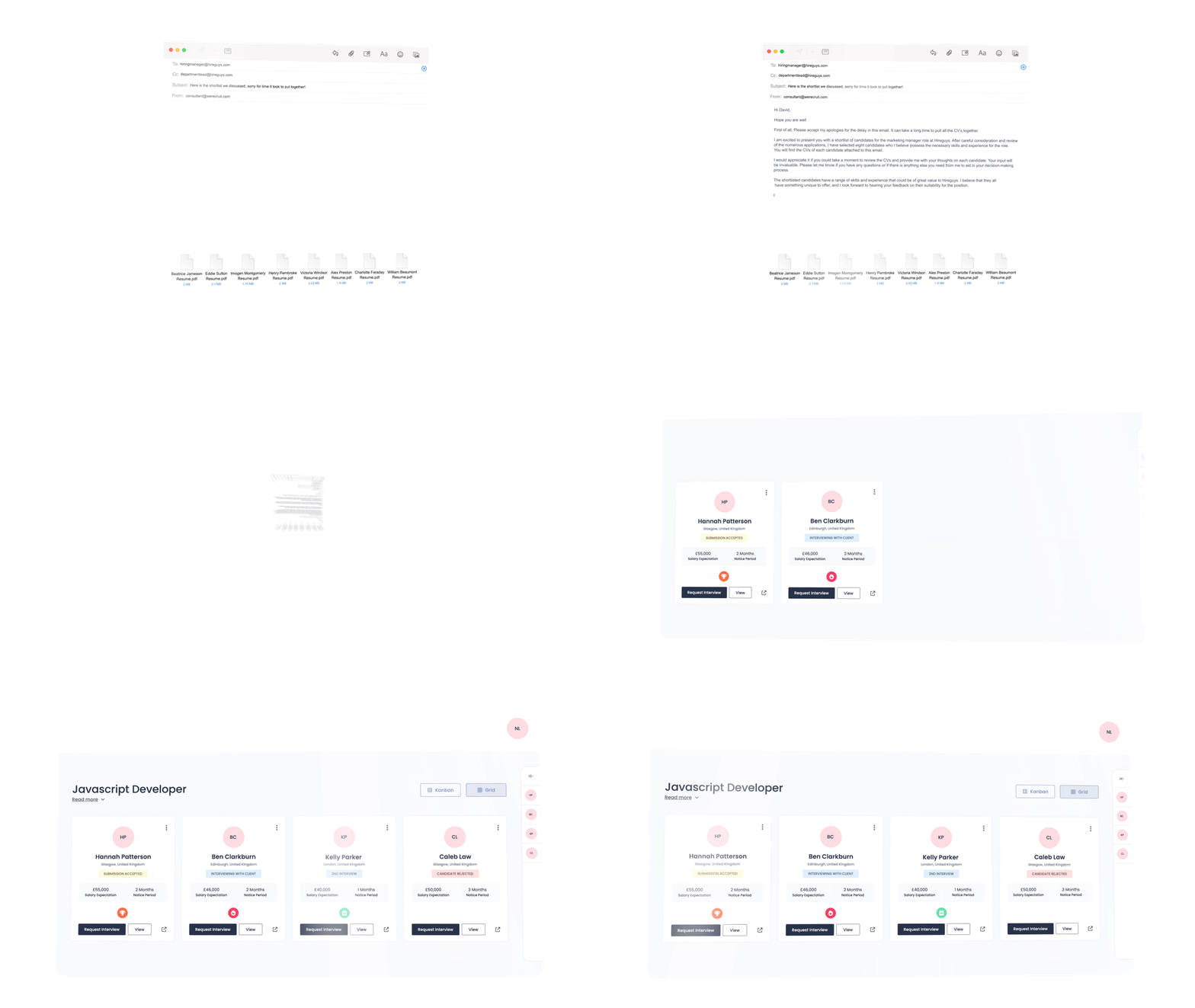
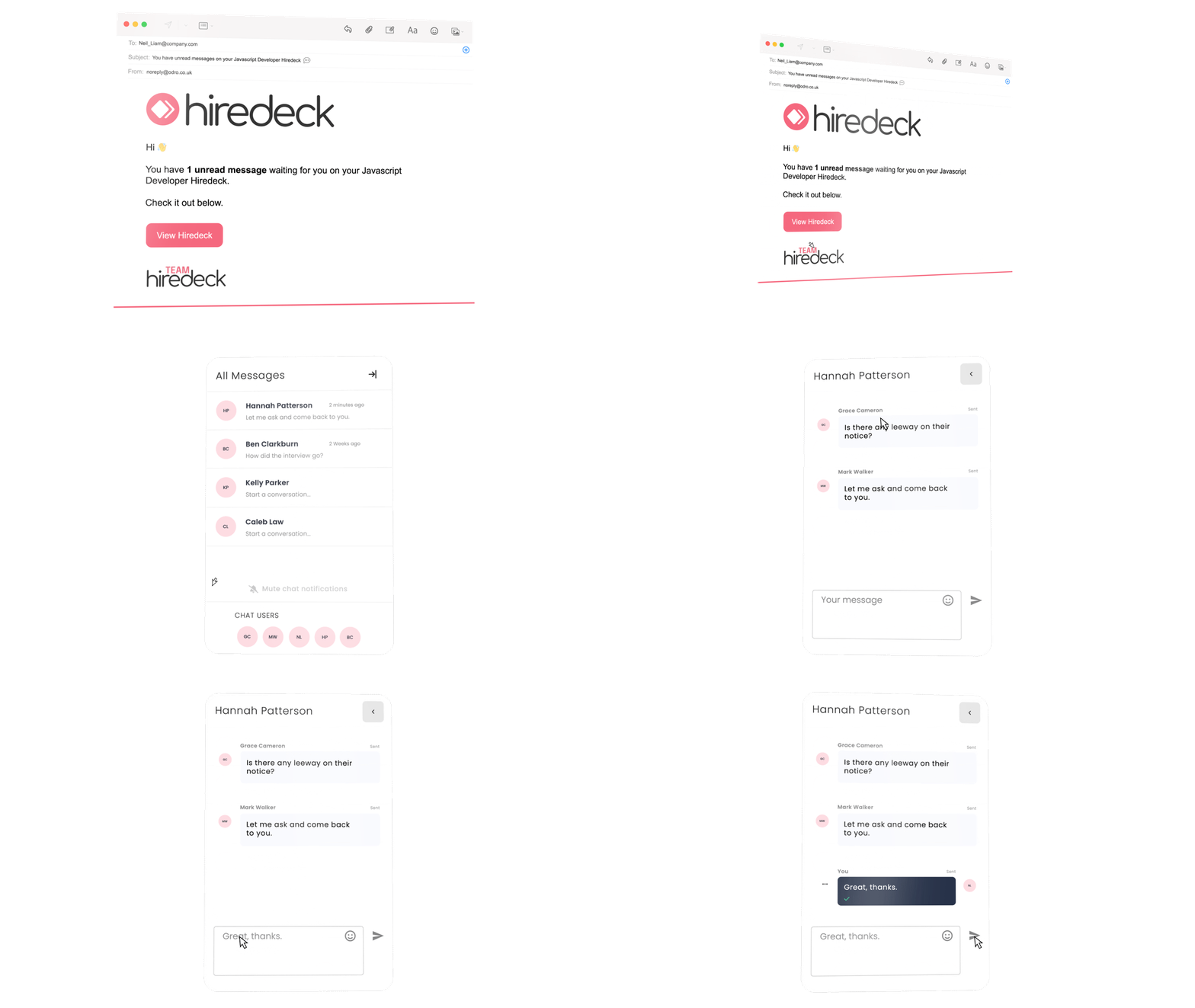
With the website being designed brilliantly by Brand North- the head of marketing and I worked closely in creating assets including CTA’s, GIF’s and imagery to be used on the website. Here you can see some of the GIF’s created to show off the product's features, and below are GIF’s showing off the new products interface and functionality.


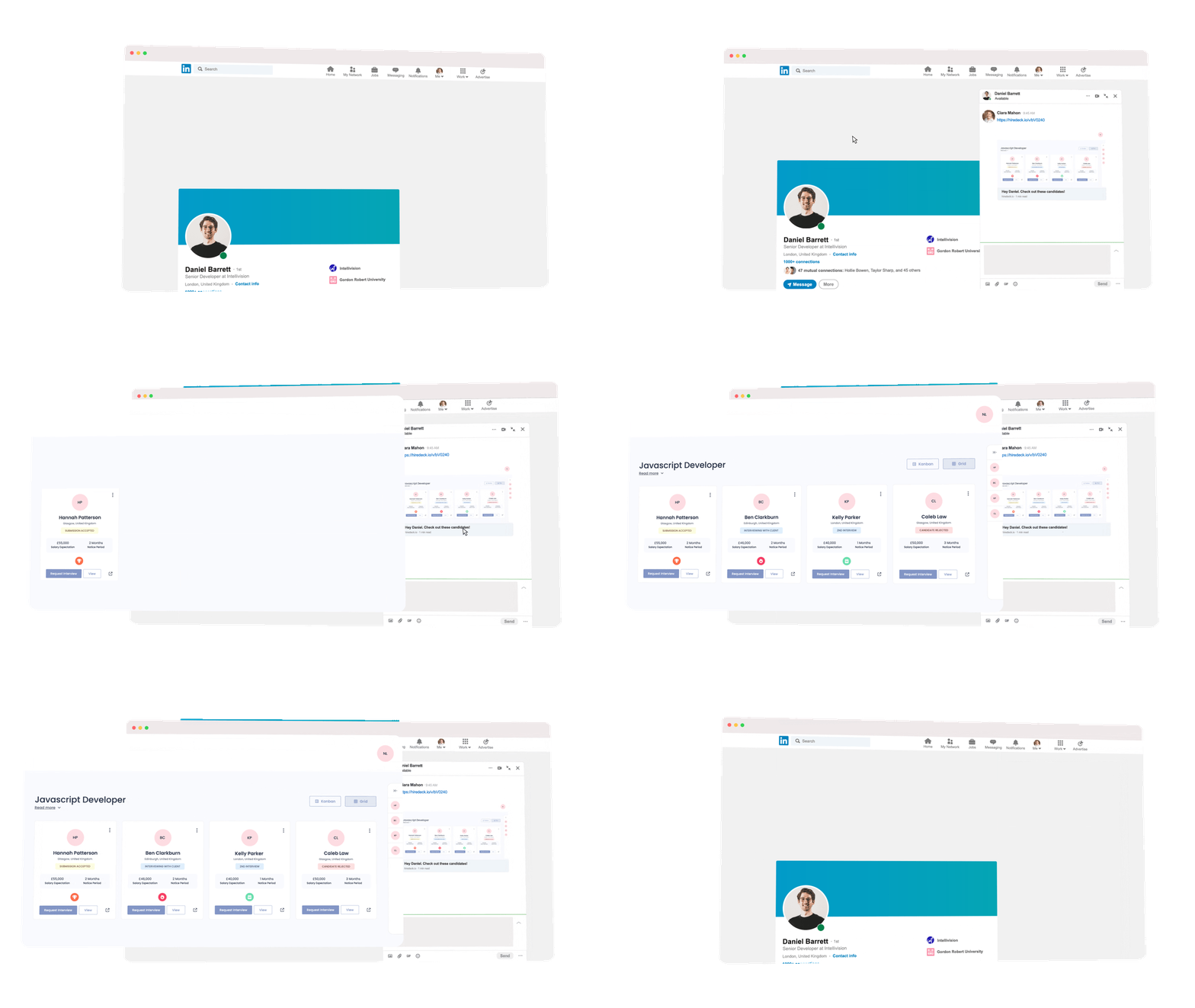
LinkedIn plays a key part in Odro’s marketing, and this was to be carried on with Hiredeck. Here we have highlights of the many images and videos created for online socials to be shared by Bullhorn, staff and online supporters of the brand.


